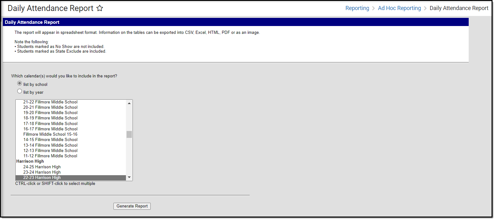
Tool Search: Daily Attendance Report
The Daily Attendance Report displays daily attendance data within a powerful pivot table, allowing you to sort, count, filter, and display the data in useful graphs and charts.
This report is only available for users in districts who have purchased the Campus Analytics Suite.
Read - View and generate the Daily Attendance Report.
Write - N/A
Add - N/A
Delete - N/A
For more information about Tool Rights and how they function, see the Tool Rights article.
Understand the Report
Once the report is generated, a pivot table grid displays and uses conditional formatting to apply a color gradient to each cell based on the attendance value. The report shows the attendance percentage and federal attendance percentage for each grade per day, with colors indicating how close or far away the percentage is from 100%. This color gradient also allows you to easily identify which grades per date have a lower percentage and may require additional analysis. Since the report logic relies on the Attendance Aggregation Day tables, the report does not reflect current day attendance and lags by 1 day.
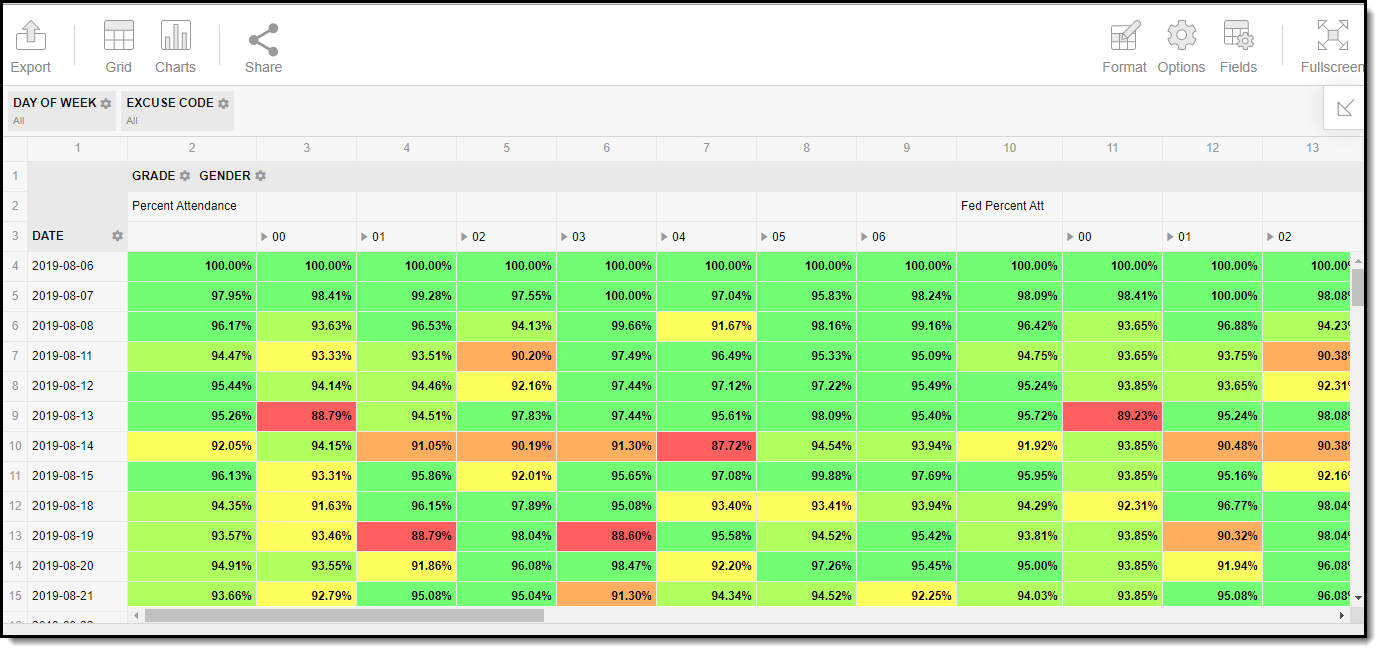
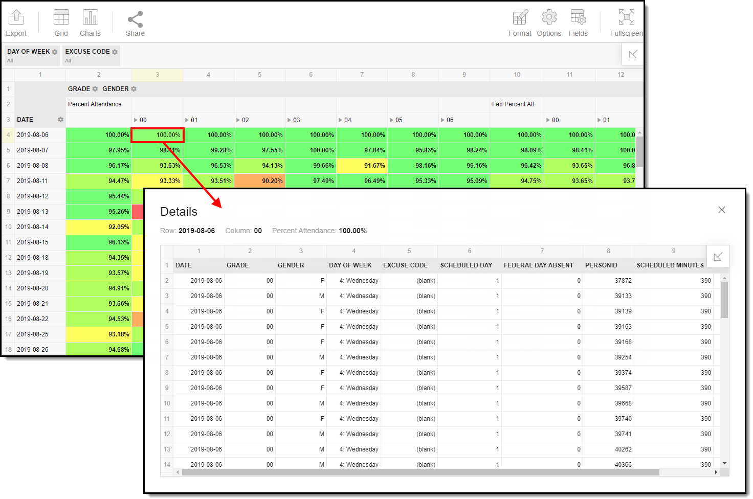
The data used to determine each column can be viewed by double-clicking on a specific cell. This allows you to analyze all the data that makes up a cell's reported percentage. You can also view pivot table data in a chart to better identify trends and outliers.
Display Report Data in a Chart/Graph
Report data can be visually displayed in a number of charts. To create a chart, click the Charts icon and select a chart type.
See the links below for more information about each chart option.
Filter Dimensions and Modify Report Options
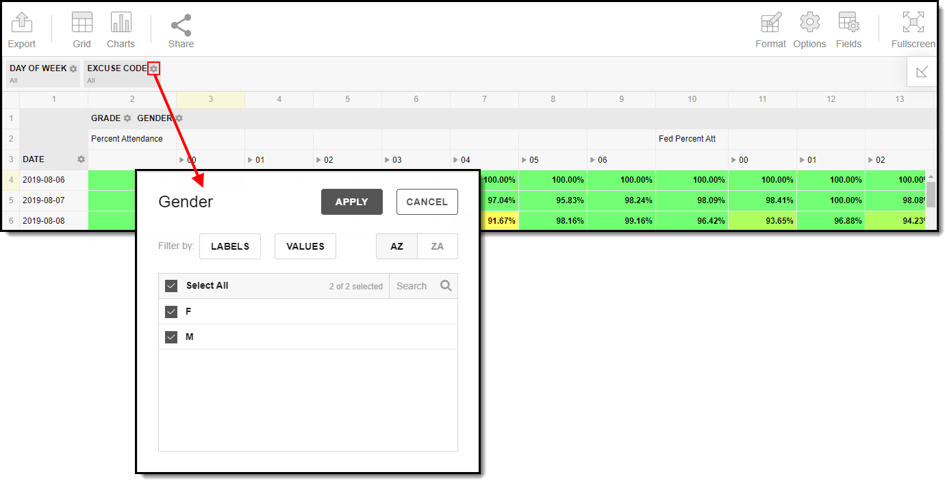
You can filter a report dimension by clicking the gear icon ![]() next to the dimension header. From here you can filter dimension data by label or value as well as modify the dimension sort order. For more information about filtering dimensions, see the Pivot Designer article.
next to the dimension header. From here you can filter dimension data by label or value as well as modify the dimension sort order. For more information about filtering dimensions, see the Pivot Designer article.
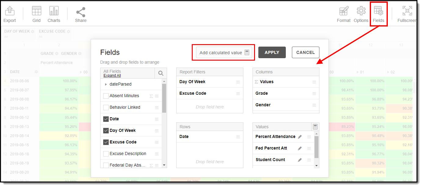
Selecting the Fields icon allows you to modify the order of the fields in the pivot, add or remove fields from the pivot table, and modify which fields are used in rows or columns.
You can also modify or insert specific calculations to be used in the pivot table by clicking the Add calculated value button. When adding calculated values, users can use aggregation key words to produce aggregates that aren't available when selecting the sigma droplist.
For more information about modifying fields and adding calculated values, see the Pivot Designer article.
Format and Layout Options
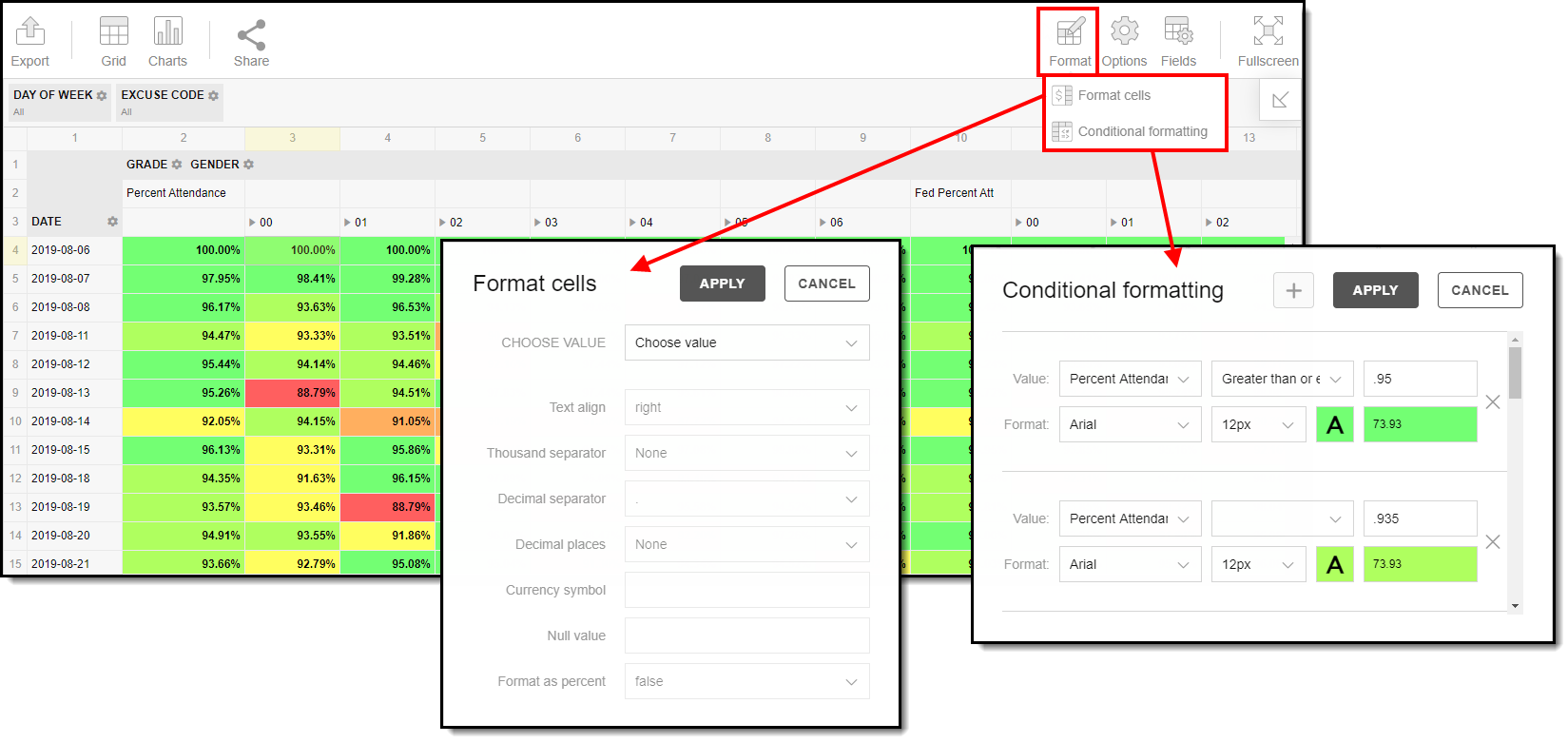
Format options allow you to modify how cells represent data within the pivot table. To access format options, click the Format button and select one of the following options:
- Format cells - This editor allows you to control how text within the cell is aligned, what value is reported in the cells, how decimals are used, the current symbol used, any default null value you want the table to display, and whether or not you want data displayed as a percentage.
- Conditional formatting - This editor allows you to set cell value thresholds as to whether or not the data is reported for each cell (less than or greater than a certain value) as well as modify the cell text size and font.
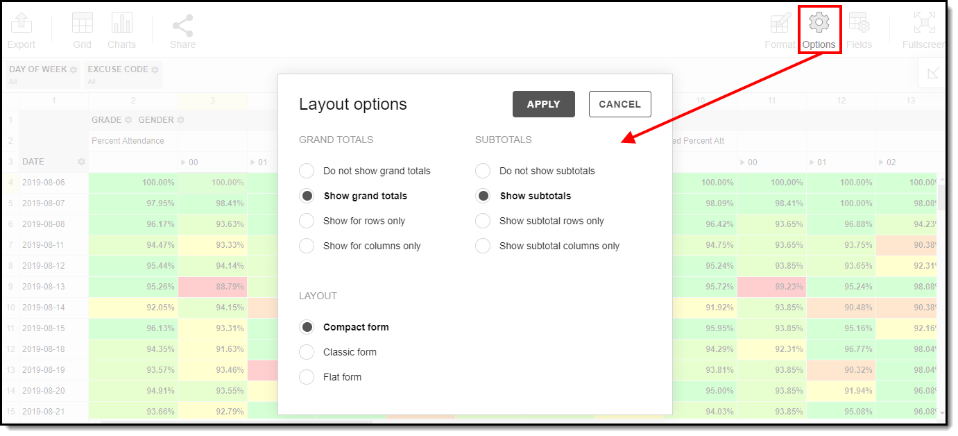
The Options menu gives you layout options for how you would like the table to be displayed (Layout), how grand totals are display in the table (Grand Totals), and how subtotals should be displayed (Subtotals).
For more information about format and layout options, see the Pivot Designer article.
Export and Share the Report
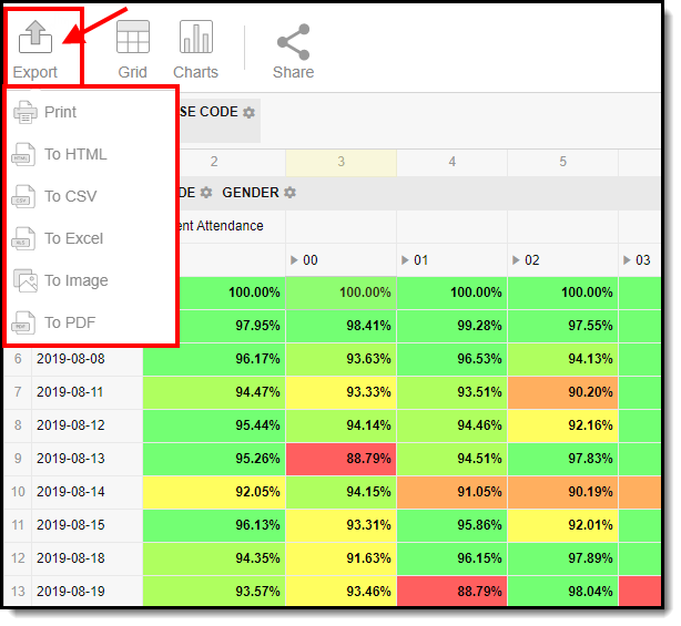
The report (pivot) can be exported to a number of different formats by clicking the Export icon and selecting an option.
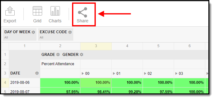
You can also share the report (pivot) with other Campus users by clicking the Share icon and copying the report URL.
Users attempting to access a pivot table via a shared URL will need to first be logged into Campus in order to access the tool and have proper calendar rights in order to see reported data.