Tool Search: Absenteeism Tier
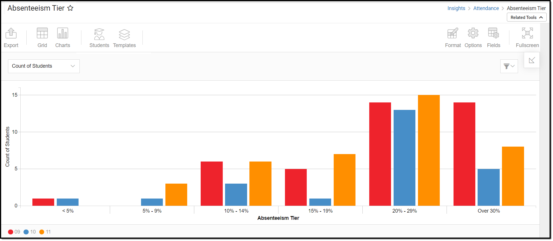
The Absenteeism Tier provides an aggregate view of student absenteeism, broken into percentage groups. This allows you to quickly and easily view chronic absenteeism for students with an Early Warning Attendance score between 50 and 100.
This report is only available for district users who have purchased the Campus Analytics Suite.
To view the chart, you must have at least Read tool rights for the Absenteeism Tier and calendar rights assigned for any calendar(s) reporting data.
NOTE: Insights visualizations may contain PII and include data for tools a user may not have rights to access.
Understanding the Chart
The Absenteeism Tier displays student absenteeism broken into percentage groups (for students with an Early Warning Attendance GRAD score between 50 and 100). For example, students in the Over 30% group were absent for more than 30% of the scheduled school days in the reporting year.
Double-clicking a bar will show you a table detailing all the data that makes up that bar.
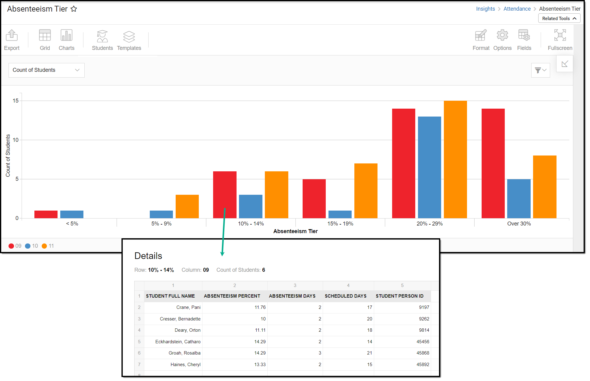
Use the table below for help in understanding each sub-report column:
| Column | Description |
|---|---|
| Student Full Name | The student's full name. |
| Absenteeism Percent | The percentage of days the student was absent in the reporting school year. |
| Absenteeism Days | The total number of days the student was reported absent. |
| Scheduled Days | The total number of scheduled school days. |
| Student Person ID | The personID for the reporting student. |
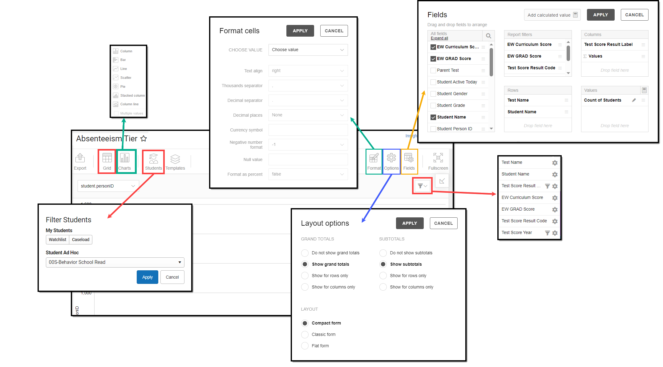
You can remove and filter any data that makes up the graph by clicking the button, selecting the type of data you wish to filter, and unchecking the data you wish to remove.
Filtering Chart Data
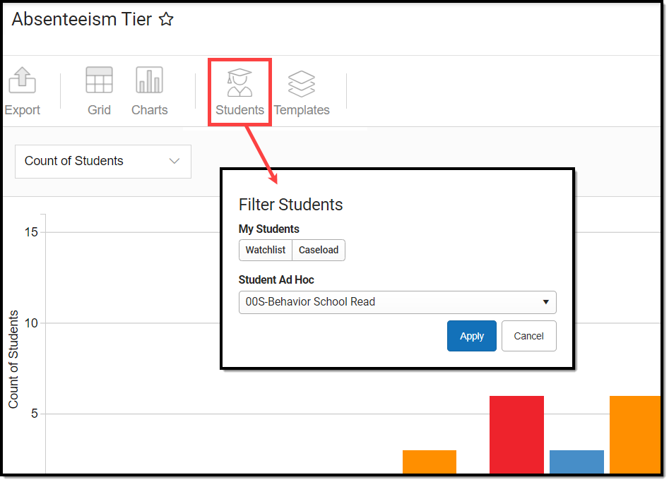
You can filter chart data to only students in your Early Warning Watchlist, Counseling Caseload, and/or a specific Student Ad Hoc filter by clicking the Students button and selecting any combination of these options.
Ad Hoc Queries and Selection Editors are supported in Insights by filtering from the Student panel.
Pass-through SQL Queries are not supported in Insights.
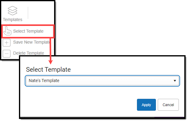
Creating Templates
Templates allow you to save all filtering and formatting options you have set for a chart and have these options automatically applied each time you select a template. Templates are chart-specific, meaning they are only available and apply to the chart for which they were created.
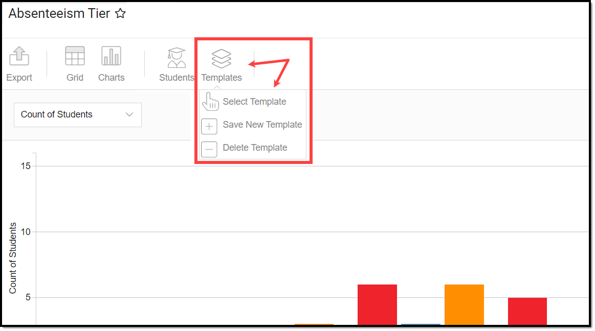
For example, if you filter the chart data by Watchlist in the Student option (see section above) and modify any formatting and field options (any options shown below), all your selections can be saved as a template by clicking Templates and selecting Save New Template.
Once saved, each time you return to this chart you can automatically apply these options by clicking Select Template, choosing the template, and selecting Apply.
Additional Report Options
The table below directs you toward additional information about the other on-screen options.
| Option | Description |
|---|---|
Grid and Chart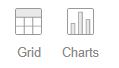 | Report data can be viewed in a grid or other visualization charts. See this article for more information. |
Format | Format options allow you to modify how cells represent data within the report. See this article for more information. |
Options | The Options menu gives you layout options for how you would like the table to be displayed (Layout), how grand totals are displayed in the table (Grade Totals), and how subtotals should be displayed (Subtotals). See this article for more information. |
Export | The report can be exported to a number of different formats by clicking the Export icon and selecting an option. See this article for more information. |
Fields | The Fields icon allows you to modify the order of the fields in the report, add or remove fields from the report table, and modify which fields are used in rows or columns. See this article for more information. |
