Tool Search: Student Demographic Report
This report is only available for users in districts who have purchased the Campus Analytics Suite.
The Student Demographic Report visualizes the distribution of Census > Demographics data like gender, age, and race/ethnicity. It can be grouped and filtered by school, calendar, or year making it ideal for identifying changes in demographic patterns year to year.
 Student Demographic Report
Read - View and generate the Student Demographic Report.
Write - N/A
Add - N/A
Delete - N/A
For more information about Tool Rights and how they function, see the Tool Rights article.
Generate the Report
There are many ways you can generate this report to find valuable and meaningful data. The following instructions will walk you through one of the many use cases for this report.
In this use case, we will analyze the distribution of the number of girls enrolled in a school compared to the number of boys in the school over the past 5 years.
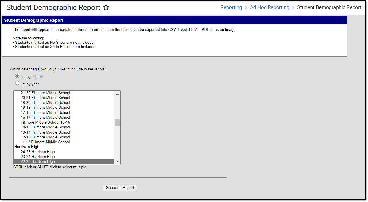
- To start, select the calendars for end years 2020-2016 and click Generate Report.
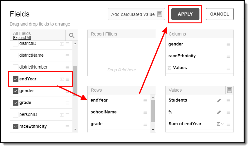
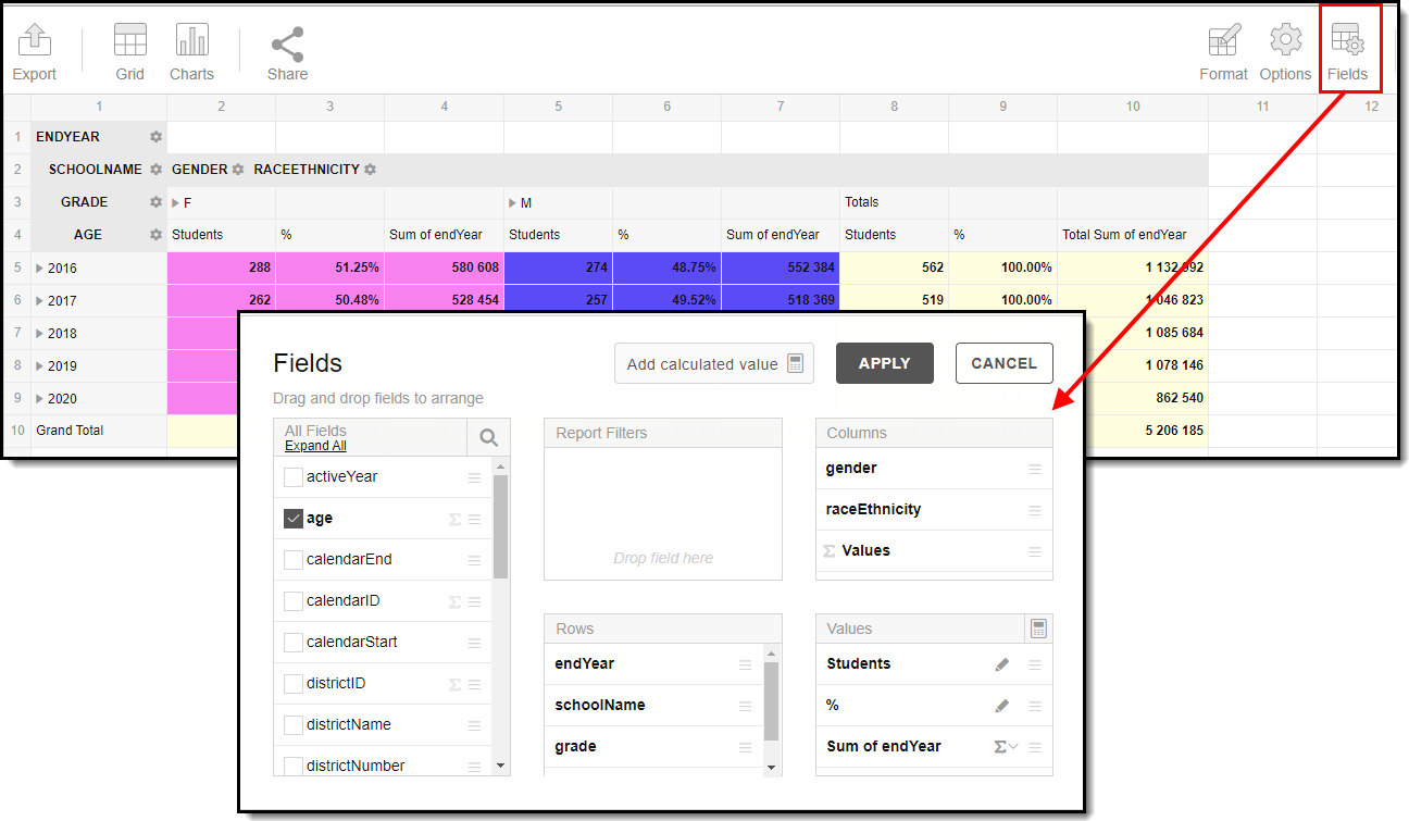
- By default, data will appear in a color-coded bar graph. Click the Fields icon.
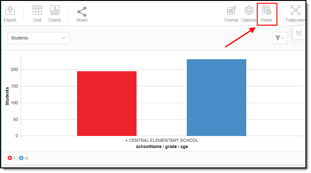
- Mark the endYear checkbox, drag it into the Rows area (see image below) and click Apply.
- Once applied, the distribution of gender by year displays. Bar chart is the default, but you can change this to other chart options by clicking the
 button.
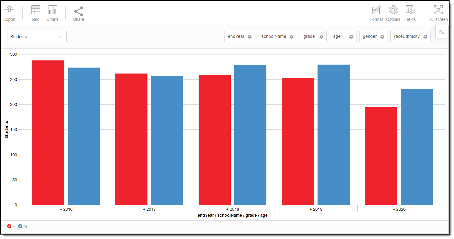
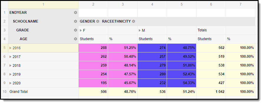
If you want to drill down into the data or expand multiple dimensions, you can switch to the grid view by clicking the
 icon and double-clicking individual cells within the grid or by expanding rows/columns.
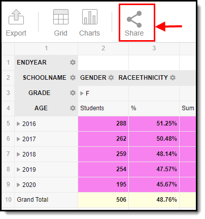
 When looking at gender data using the grid you may notice the cells are colored. That is hard-coded conditional formatting that cannot be changed. Female will appear pink and male will appear blue. These are the only demographic fields that correspond to a color automatically.


Filter Dimensions and Modify Report Options
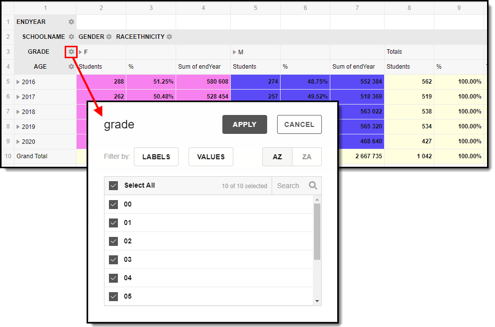
You can filter a report dimension by clicking the gear icon ![]() next to the dimension header. From here you can filter dimension data by label or value as well as modify the dimension sort order. For more information about filtering dimensions, see the Pivot Designer article.
next to the dimension header. From here you can filter dimension data by label or value as well as modify the dimension sort order. For more information about filtering dimensions, see the Pivot Designer article.
Selecting the Fields icon allows you to modify the order of the fields in the pivot, add or remove fields from the pivot table, and modify which fields are used in rows or columns.
You can also modify or insert specific calculations to be used in the pivot table by clicking the Add calculated value button. When adding calculated values, users can use aggregation key words to produce aggregates that aren't available when selecting the sigma droplist.
For more information about modifying fields and adding calculated values, see the Pivot Designer article.
Format and Layout Options
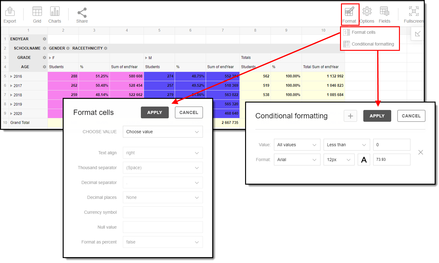
Format options allow you to modify how cells represent data within the pivot table. To access format options, click the Format button and select one of the following options:
- Format cells - This editor allows you to control how text within the cell is aligned, what value is reported in the cells, how decimals are used, the current symbol used, any default null value you want the table to display, and whether or not you want data displayed as a percentage.
- Conditional formatting - This editor allows you to set cell value thresholds as to whether or not the data is reported for each cell (less than or greater than a certain value) as well as modify the cell text size and font.
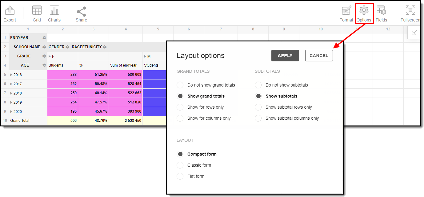
The Options menu gives you layout options for how you would like the table to be displayed (Layout), how grand totals are display in the table (Grand Totals), and how subtotals should be displayed (Subtotals).
For more information about format and layout options, see the Pivot Designer article.
Export and Share the Report
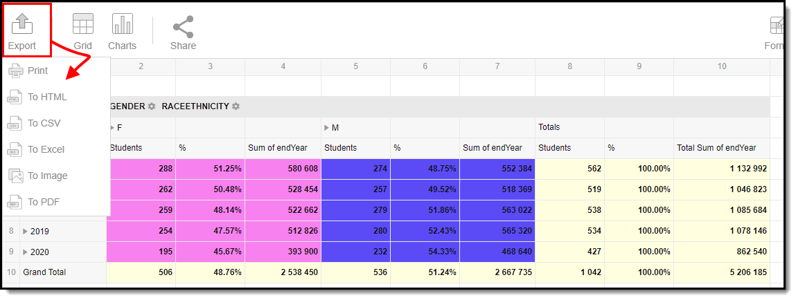
The report (pivot) can be exported to a number of different formats by clicking the Export icon and selecting an option.
You can also share the report (pivot) with other Campus users by clicking the Share icon and copying the report URL.
Users attempting to access a pivot table via a shared URL will need to first be logged into Campus in order to access the tool and have proper calendar rights in order to see reported data.