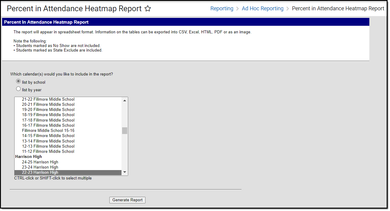
Tool Search: Percent in Attendance Heatmap Report
The Percent in Attendance Heatmap Report gives users a quick and easy way to identify days on which many students were marked absent. Using a color scale, the heat map helps visualize the volume of events within a data set.
This report is only available for users in districts who have purchased the Campus Analytics Suite.
 Percent in Attendance Heatmap Report
Read - View and generate the Percent in Attendance Heatmap Report.
Write - N/A
Add - N/A
Delete - N/A
For more information about Tool Rights and how they function, see the Tool Rights article.
Understanding the Heatmap
Using a color scale, the Attendance Heatmap helps visualize the volume of events within a data set, giving you a quick and easy way to identify days on which many students were marked absent.
Each square represents a day record where the Attendance checkbox is marked. The calculation is (total absent students / total students) * 100 to get a percent in attendance per day.
Bright green corresponds to fewer absences while dark red corresponds to many absences. As you can see in the image below, the change in color gradient can be small. When a user clicks on a square or hovers the cursor over it, the date and percent in attendance displays, making the subtle differences easier to understand. Very low attendance days are obvious as they will appear red amongst mostly green days surrounding it.
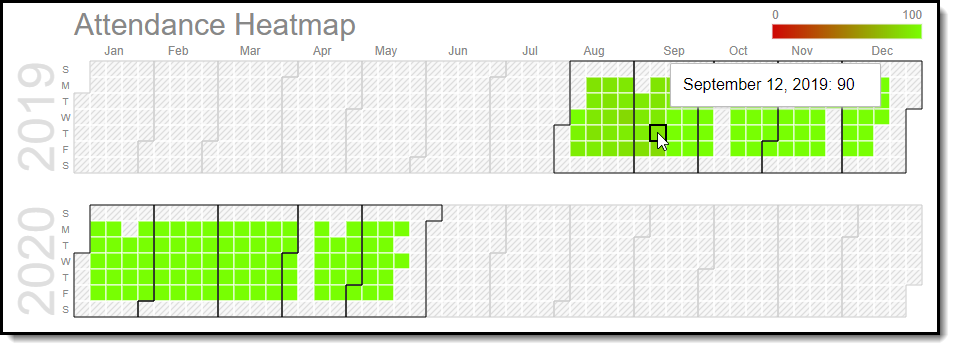
Image 2: Attendance Heatmap
